

Wow, this rebrand. It has single-handedly stirred up some of the juiciest gossip Philly’s creative scene has seen in ages. I thought the buzz would’ve died down by now, but here we go again.
So, what’s the deal? Do we like it? I keep going back and forth…more on that in a bit.
The Reactions
Let’s start with a few harsh (but true) takes.
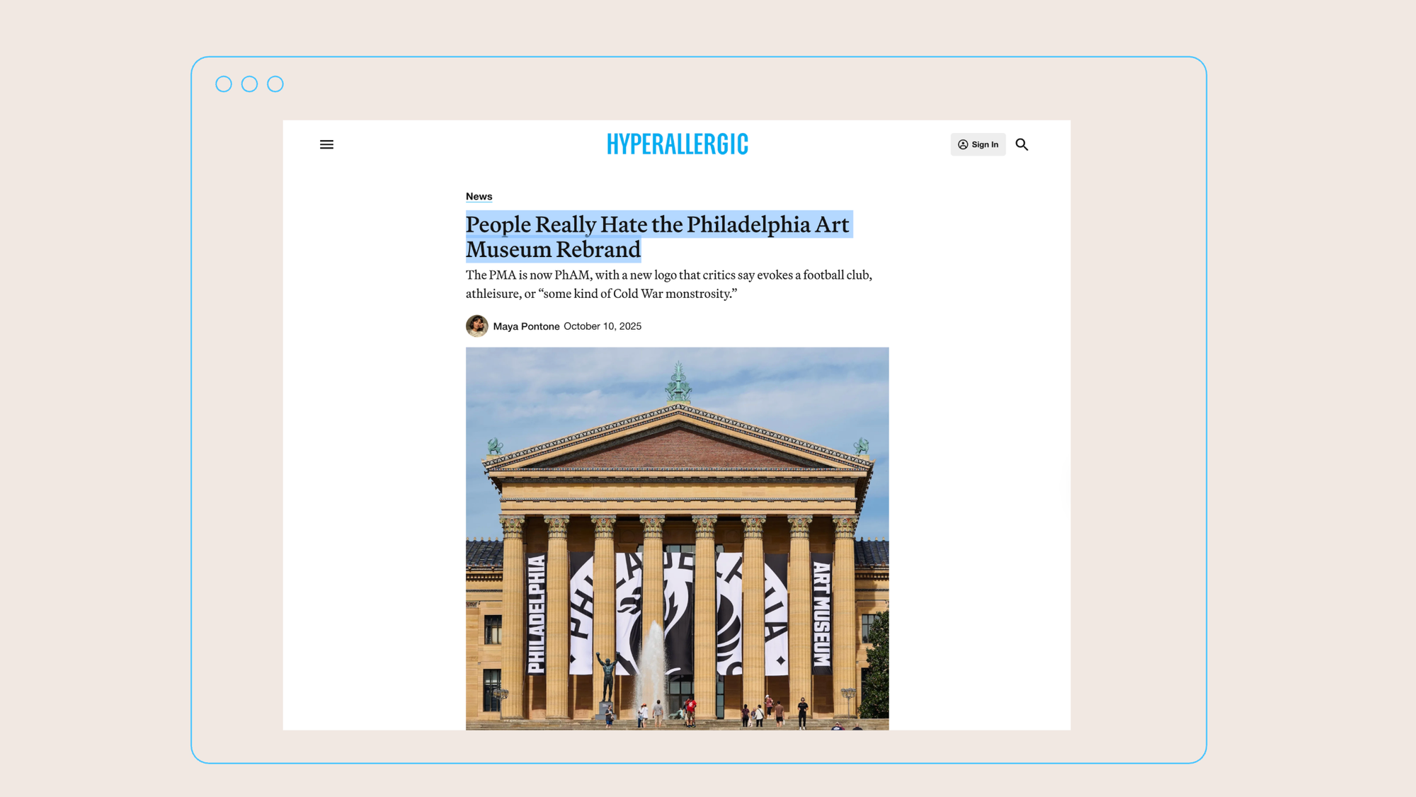
Hyperallergic came right out and said it: “People Really Hate the Philadelphia Art Museum Rebrand.”
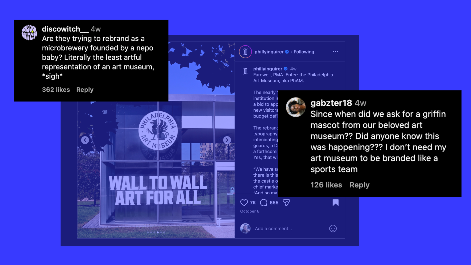
On The Inquirer’s post, the comments section said everything: Is it a soccer team? A nepo-baby brewery?
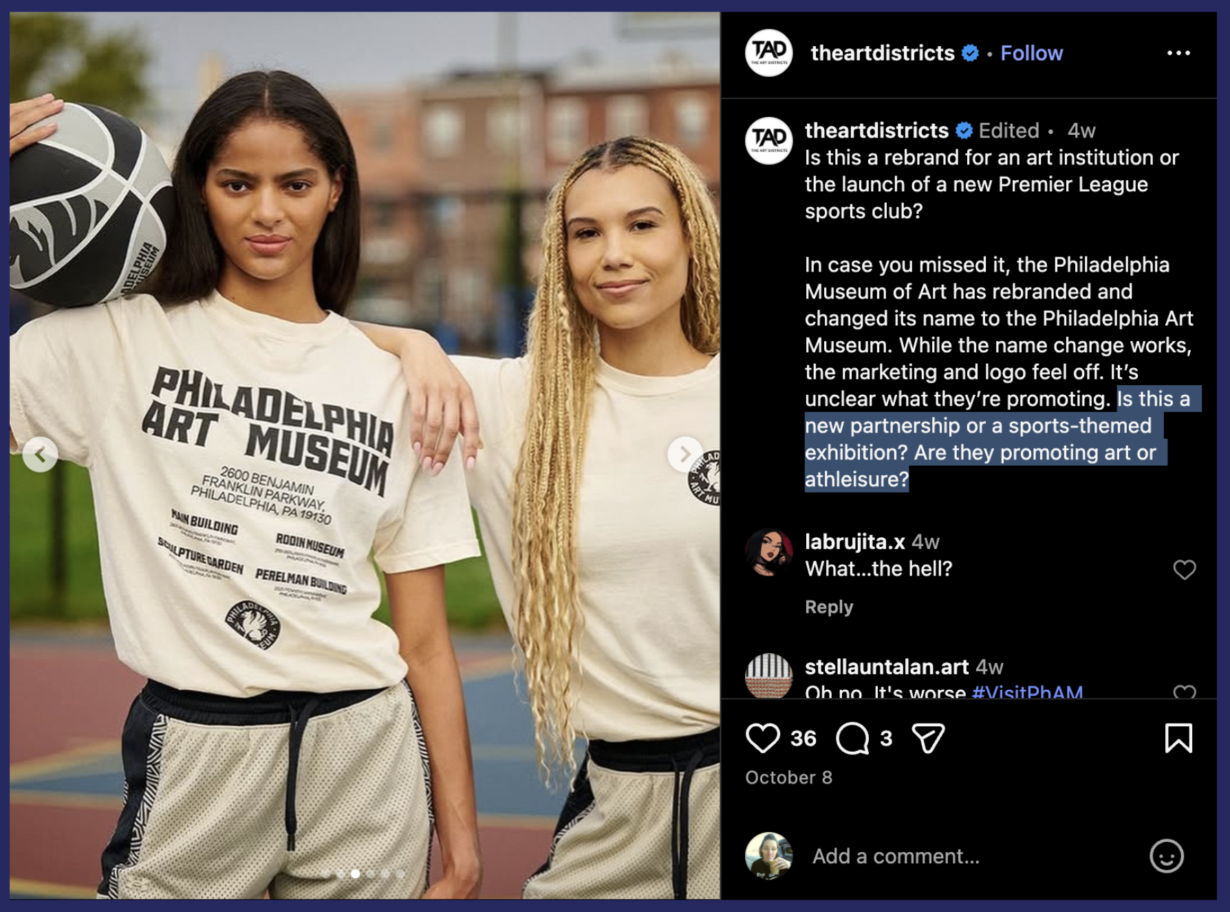
And @theartdistricts chimed in: “It’s unclear what they’re promoting. Is this a new partnership or a sports-themed exhibition? Are they promoting art or athleisure?”
When I first saw the design, my gut reaction was, this can’t be it. Neither the font nor the logo felt quite right for such a legacy institution. It's not that I thought the design itself was bad, but it’s just so drastically different from what came before that it’s jarring.
That split reaction played out across my own feeds, too. Friends who’ve worked at the museum were… not into it. My more neutral designer friends, on the other hand, lightly praised it. And they’re not wrong — it is good work. Gretel, the Brooklyn-based agency behind the identity, is one of the best. I love their stuff. But the fact that they were behind it also stings a little, because why on earth was a Brooklyn studio chosen for one of the most Philadelphia-coded jobs imaginable?
**shakes head**
Of course, any reaction at this stage is purely emotional. Most of us feel protective of the museum and, by extension, the city. The museum is a massive cultural keystone, and watching it get dragged online stings. As one trustee told The Inquirer:
“We are an amazing museum with an amazing collection, amazing curators and an amazing experience, and it’s really a shame, the jokes and negative reaction to the rebranding.”

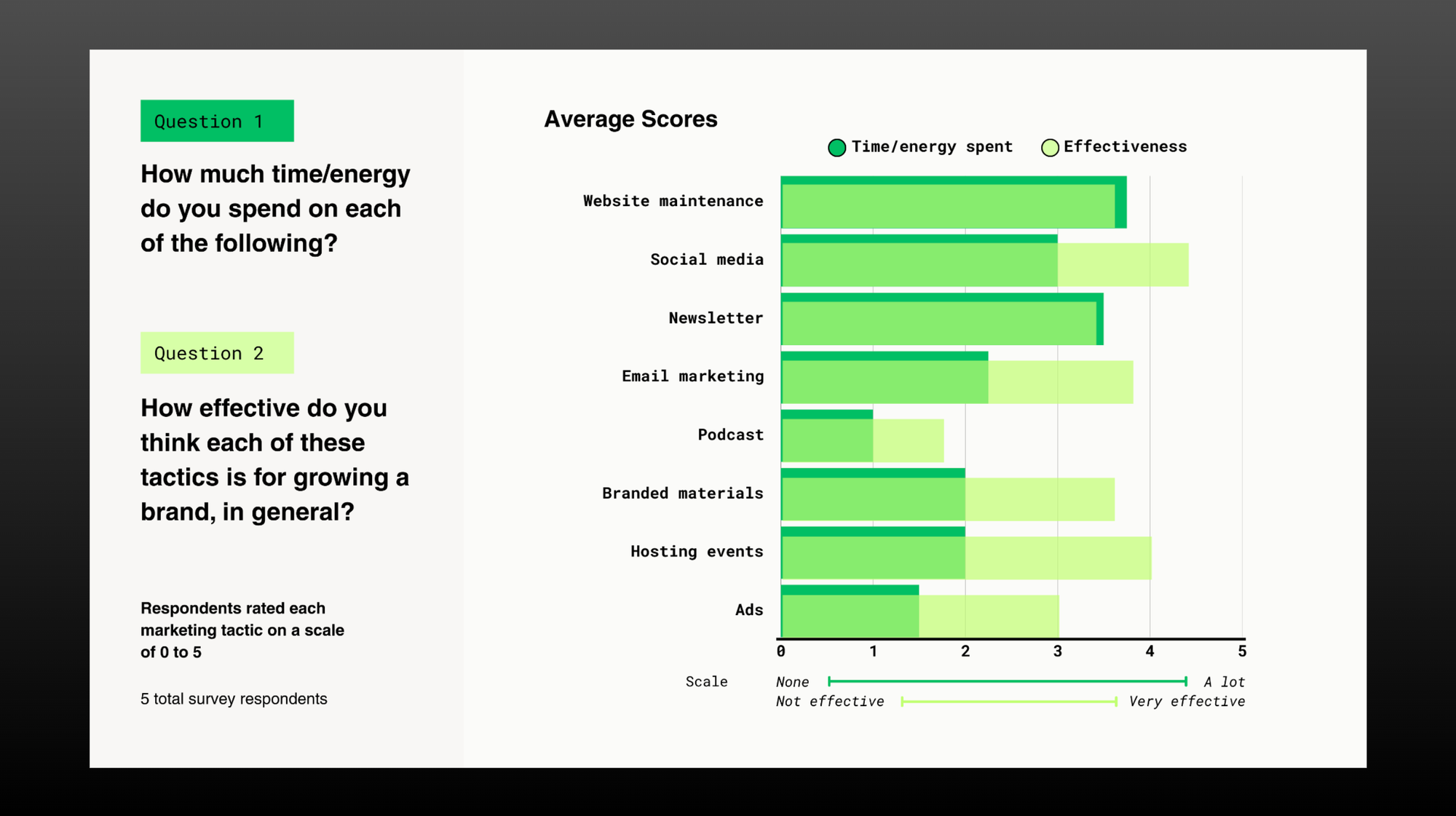
Once the initial shock wore off, my curiosity kicked in. Most of the early coverage of the rebrand focused on the black-and-white logo and wordmark (which, admittedly, I still don’t love), but once I saw the full system on Gretel’s site, I really came around. The expansiveness of it is truly amazing: the colors, the hand-crafted type, the messaging, the energy. It’s a rich, flexible system that you can easily imagine animating exhibitions and splashing across social media.
Sheri L. Lambert, a marketing professor at Temple, praised it for being purpose-built for “scrolling, swiping, and sharing.” I agree. It feels electric, punchy, and tailor-made for the world we live in. It’s the kind of visual language that makes you feel pumped up, in the same way that a really good Nike ad makes you want to go for a run. (Again, it’s sporty!)
But in the same breath, the qualities that make it feel compelling also make it feel commercial and slick. The design doesn’t shout Philly, it feels like a brand who’s chasing mass appeal. And that’s the tension.
So, Who’s It For?
Gretel is a premier agency, and with a $250K+ price tag, this rebrand was always going to be a product: fashionable, refined, global. And yet, approachability was supposed to be the focus. As Paul Dien, the museum’s CMO, told The Inquirer:
“We have research that shows there’s this perception that we’re the castle on the hill. My job right now is to ask, ‘How do we come down the steps and meet people where they’re at?’”
It’s a good question — but can a rebrand really change behavior, or does it just change how the museum looks to itself and others? Brand attachment is notoriously hard to measure, so institutions cast a wide net. Defy, a Philly-based agency, summed it up in their reaction video: the arts aren’t funded by the arts community, so museums have to appeal to the broadest audience, including corporate sponsors. The brand must be palatable, sellable, universal. But in chasing universal appeal, local identity can suffer — and here, it did.
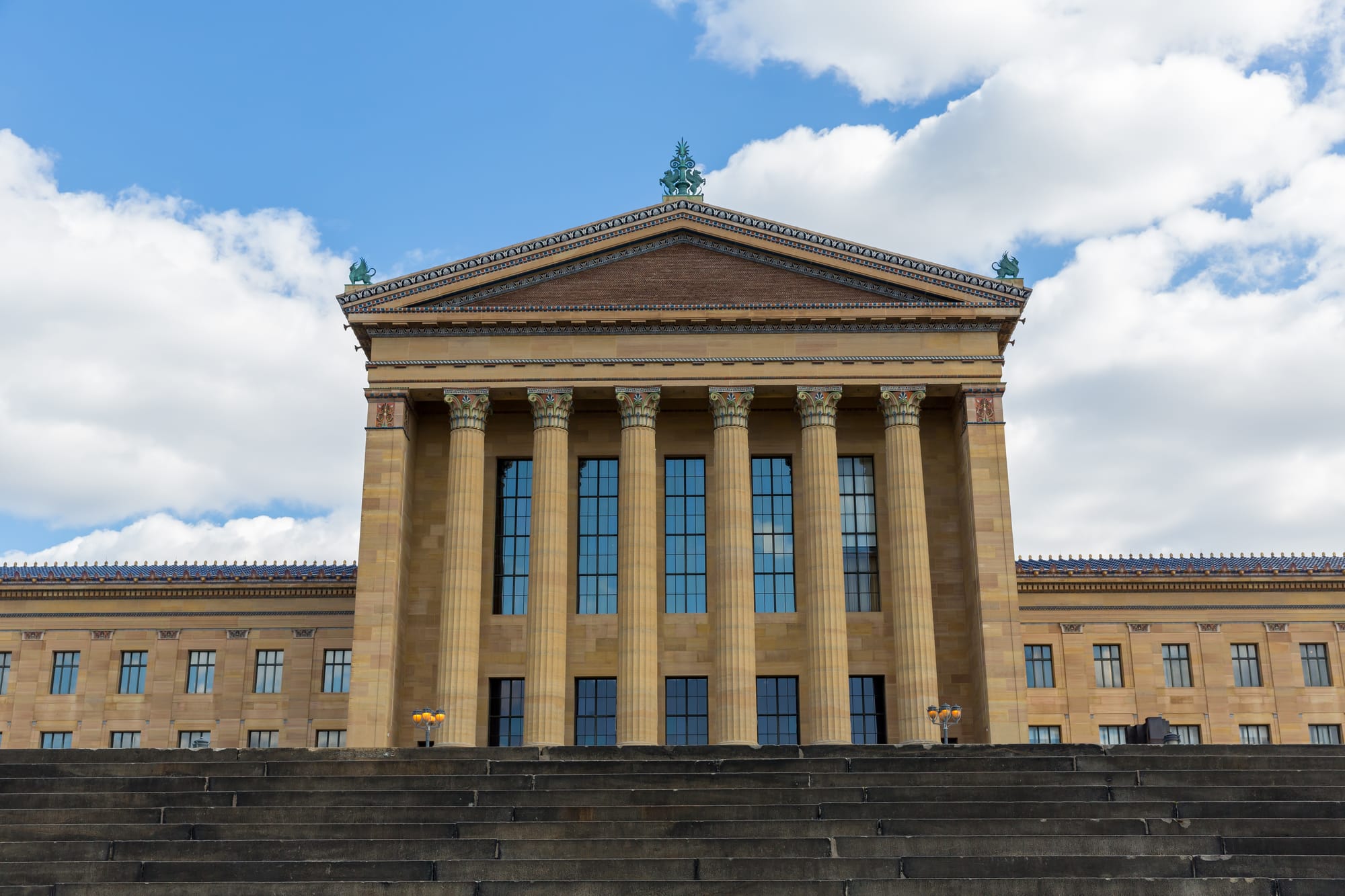
By trying to speak to everyone (and hiring such a prestigious agency) the museum distanced itself from the people who already loved it. And in Philly, that alienation extends beyond the arts community; it reaches all Philadelphians — because the relationship between the museum and the city runs deep. The building itself is prolific. Visible from the Schuylkill Expressway, the site of protests, parades, marathons, and first-time visits. It's not just an art institution, it’s a symbol of our city and a backdrop to our memories. Philadelphians don’t need to be convinced to love it, they just need the museum to remind them why they already do.
That’s the universal truth about design: a rebrand doesn’t succeed by reinventing an image from the ground up. It succeeds by reflecting the relationship between the institution and the people who make it matter. Reflection first. Reinvention second.
The old PMA logo didn’t reflect the people of Philadelphia — but does the griffin do the trick? I’m not sure. A griffin isn’t the first thing I think of when I think of the museum, but I’m open to being convinced.
What Happens Now
The museum’s comms team now carries the enormous responsibility of helping us all connect the dots between how we feel about the museum’s new look and how we connect with the institution inside. It’s a tough spot to be in (and further evidence that comms teams everywhere should be paid more), especially when so many people have already decided that they dislike the design.
Thankfully, Gretel has set them up with an expansive, flexible system that can grow and shift under pressure. Who knows, maybe they’ll even sell us on rooting for this new sports team. Go Griffs?
The museum’s ex-director and CEO, Sasha Suda, seemed confident. She said:
“If something creates conversation around the institution at this time, then it’s good, whether it’s positive or negative.”
Well, sort of.
Ultimately, the real success of this rebrand won’t be measured in likes and comments, or attendance numbers, but in whether Philadelphians still feel like the museum belongs to them.
So, good luck to the comms team. I’m rooting for them, for the PhAM, and for Philly.

Comments