The Basics: Brand Identity

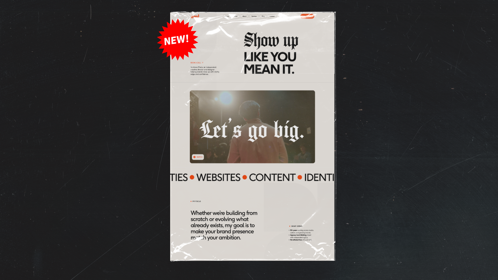
There’s a certain whiplash that comes with my freelance work. I bounce between two very different types of projects: some sleek and polished, others intentionally scrappy, often with much smaller budgets. The contrast always makes me think about what “real” design even means.

Big brands usually have a team (or several) focused on design, plus an intensely detailed brand system to keep everything aligned. Smaller brands are often DIYing it, with a few trusted fonts, some go-to colors, and a healthy amount of improv. But both are designed. And both can be effective.

Still, I’d be lying if I said imposter syndrome doesn’t creep in, especially when I’m working with a massive brand system from a top-tier agency. Those brand guidelines are gorgeous and precise (and probably cost more than my yearly income). They’re also a reminder of how many elite designers are out there. People who’ve memorized every Adobe keystroke and know every typographic rule by heart. But here’s the thing I always forget until I’m about halfway through a project like that: the work is never really about the design. Not right off the bat, anyway. It’s about clarity. Storytelling. Consistency. The strongest brands show up with a clear point of view, again and again—and that part is something you can build yourself.

This guide is for anyone creating their own brand identity, whether you’re launching a new business, reworking a side project, or just want your brand to feel a little more cohesive. Because you don’t need a glossy PDF or a massive identity system to look legit. Writing down a few key decisions now will help you show up more clearly and confidently moving forward.


What is a brand identity, exactly?

A brand’s identity is how it shows up in the world: how it looks, feels, sounds, what it stands for, and how it interacts with others. Agencies often deliver this in the form of a document called “brand identity guidelines.” It’s essentially a recipe: all the ingredients and instructions for bringing the brand to life.

If you’re a small business or a one-person show, you still benefit from creating a simpler version of these guidelines. Because the #1 goal is consistency. The more consistently your brand shows up—visually, verbally, emotionally—the more recognizable and trustworthy it becomes.

But being consistent is complicated. Some parts of identity (like logo usage or colors) benefit from specificity. Others (like tone) need room to flex and evolve. That’s why we call them guidelines, not rules.

As David Airey writes in Identity Designed:

“Consistency is often wrongly associated with sameness, but it can mean consistently distinctive and vibrant. That can be achieved simply by using a single typeface in a variety of ways, combining a distinctive palette with compelling copy, crafting a more extensive use of complementary elements, and myriad other ways that help to visually ingrain a brand experience to memory.”

When a brand really nails it, you’ll immediately start to notice the cohesion. You might laugh at their jokes or feel a stronger sense of connection. Brands who are really well-defined and full-realized are more likely to be deeply loved by their audiences.


What to include in your DIY brand identity

You’ll need to actually look through a real brand identity guidebook to fully understand what goes into one but it can be hard to find them online because brands usually keep them for internal use only. That shouldn’t deter you from asking around for people to share them privately with you though.

RISD’s brand identity guidelines are public and packed with examples.

RISD's guidelines

You don’t need to recreate a 40-page agency deck or build a microsite like RISD did. A Google Doc will do just fine. Here’s what to focus on:

1. Logo and Name Usage

Make sure you have your logo saved in an easily accessible spot, with versions that work in different contexts: big versions, small versions, an all-black logo (for light backgrounds), and an all-white logo (for dark backgrounds), or any other usages you see fit.

Decide:

  • What variations of the logo are allowed (color, size, orientation, cropping)?
  • How should you write your brand’s name (capitalization, punctuation, “the” or no “the”)?

Bok’s logo is simple and flexible. Over time, they’ve found ways to remix it creatively without losing consistency.

2. Fonts + Colors

Write down:

  • Which fonts and weights should be used for headings, subheadings, and body text?
  • What are your brand colors? List their hex codes.
  • Are any colors primary? Are some just accents?

3. Tone

Maybe the hardest part. Start with your brand’s core message and choose 2–3 keywords that reflect how you want to sound. From there, describe what that actually looks like in action.

Ask:

  • What’s the brand’s personality? (Playful, confident, curious?)
  • What does your brand care about?
  • How does that translate into language? What kinds of phrases or references feel on-brand?

The National Park Service’s Instagram captions are joyful, informative, funny, and awe-inspiring—all tied directly to their mission: enjoyment, education, and inspiration.

4. Visuals

Photos, videos, graphics, memes. This is a big category. But start small. Define the style and mood that fits your tone.

Ask:

  • What do your visuals need to do—explain, inspire, humanize?
  • What’s the vibe—candid? polished? playful?
  • What’s the subject—your space, your people, your product, memes?

Loco pez’s use of imagery on Instagram sparks conversation and makes you laugh. They also use multiple styles, a mix of their own photography and internet memes, which keeps things feeling variable and interesting.


Final Thoughts

You don’t need to do this perfectly. You just need to start. Even a rough draft of your brand identity can help you make clearer, faster creative decisions and show up with more confidence.

Keep it simple. Keep it flexible. And make sure it feels like you.


More Resources