
Pantone chose white. White! The best color experts in the world landed on something that barely qualifies as a color.
But white is, technically, the presence of all color. Every single hue lives inside it. So is their choice actually a fitting follow-up to the year we just had?
To recap, a few broad themes from the past year in marketing and communications:
- It was certainly the year of rage bait. We learned to crank things out quickly and impactfully, for better or for worse.
- The AI craze rose and fell (a little). Novelty wore off; people and brands became more savvy about discerning when to use it.
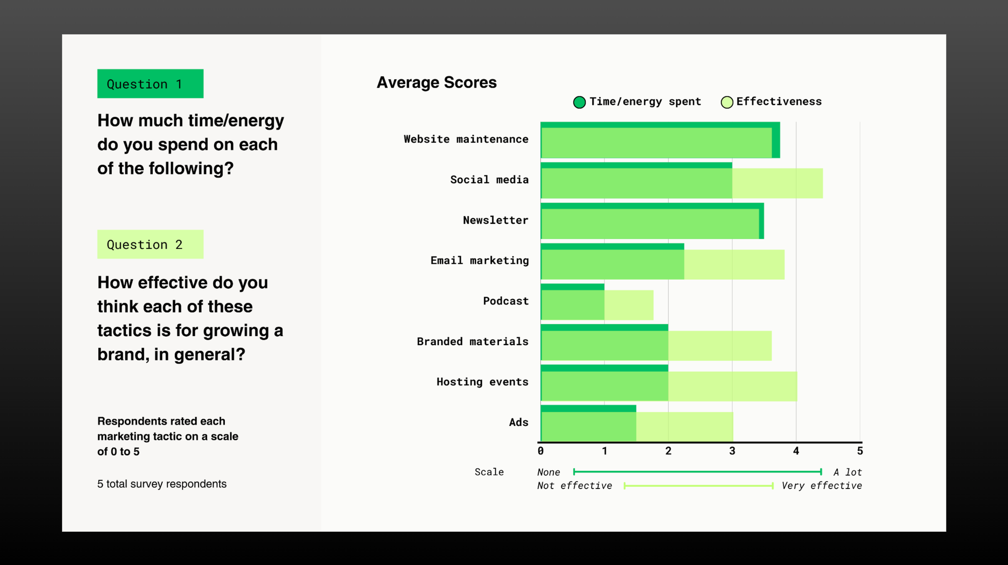
- Brands became multichannel by default: 5+ social platforms, newsletters and email marketing, podcasts, video...it was a lot of work to maintain.
- Yet nothing seemed to take off as much, because algorithms were fickle and audiences were scattered everywhere.
- We learned how to put ourselves on camera. Feeds became a sea of talking heads — all speed, density, and vertical framing.
- Brand analytics and SEO tanked due to the rise of AI as a search tool. Users weren’t making it past the AI summaries.
- Big brands got creative with partnerships and influencer marketing. Influencer marketing became a multi-billion-dollar industry.
- Marketing turned into a game of curation. There’s now a tool or agent that can help you make anything instantly; taste became the differentiator.
- Entertainment ruled. Every brand was forever chasing our very scattered attention. The ones that adapted to entertain found the most success, but meaningful connection was still required to bring people back.
2025 really was a year of plenty. So perhaps the all-color white is the perfect pairing.
Pantone’s particular pick, Cloud Dancer, “serves as a symbol of calming influence in a frenetic society.” It’s true, on a stark white webpage, the swatch looks very distinct and measured. It’s so clearly a choice, not an absence. If I were to paint my walls that color (which I would; it really is a beautiful white), it would make the room feel calmer.
A friend of mine, Margaret, went on a tangent in her Instagram Stories recently while sharing her gorgeous shots of the new Calder Gardens (which I still haven’t visited yet!). She pointed out how frustrating it is that our phones and platforms push us to film everything vertically. I agree. It’s a bummer that Instagram — the app that’s supposed to be so photo-forward! — is pigeonholing us into vertical aspect ratios. Our brains don’t even see the world that way; our devices just demand it.
I used to love these video series: My Place from Apartamento/NOWNESS, Vox’s Earworm, and Chef’s Night Out from Vice/Munchies. They feel dated now (they were filmed horizontally), but the storytelling still feels so good because it seemed to just unfold organically. It wasn’t truly organic, because the producers behind the camera were masters at their craft, but it was the inclusion of quiet moments, transitional moments, and actual space to think that made their content feel more organic and artful than what most of us are experiencing today. For years now, visual storytelling as a whole has become more lean, condensed, and straightforward.
This time last year, I wrote that we should get weirder. Things were feeling too marketable and efficient and canned and glossy back then. We needed something more authentic, more textured. And we did, I think, get grittier. But we also got grimier and louder.
Now I’m craving a shift towards craft, intention, and artistry. It could be in the form of a cloud-like shade of white. Or it could be something delivered at a slower pace. It definitely doesn’t mean quieter or more neutral, though. I’d like to feel calm, but I’d also like to feel confident in the spaces that I inhabit. What about you?
…Maybe a few more horizontal aspect ratios, too, if we’re nitpicking.
Comments