
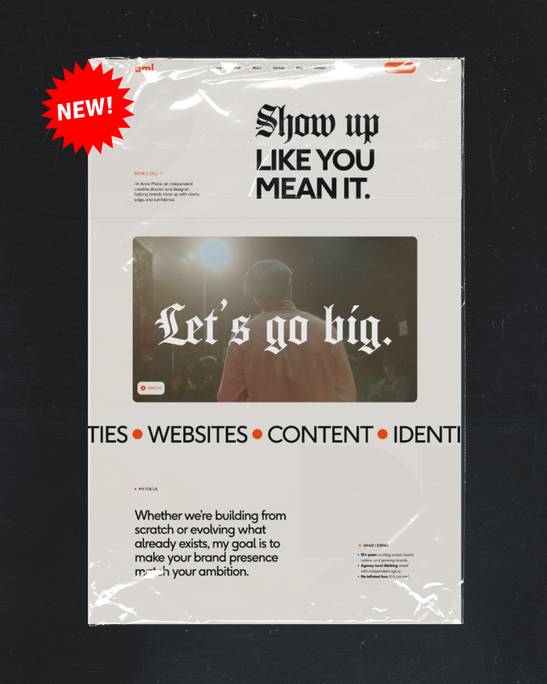
As I'm writing this, it's 70 degrees outside, the Phillies are playing, and I just sowed some seeds. Bada bing bada spring! I feel happier already. I took spring cleaning to a whole new level this year and did an entire revamp of my brand identity and website — the most exciting part of which, I think, is the addition of a gothic typeface. They say not to embrace trends in your branding (I feel like blackletter has been everywhere lately, do you?) but I did it anyway because I love it.
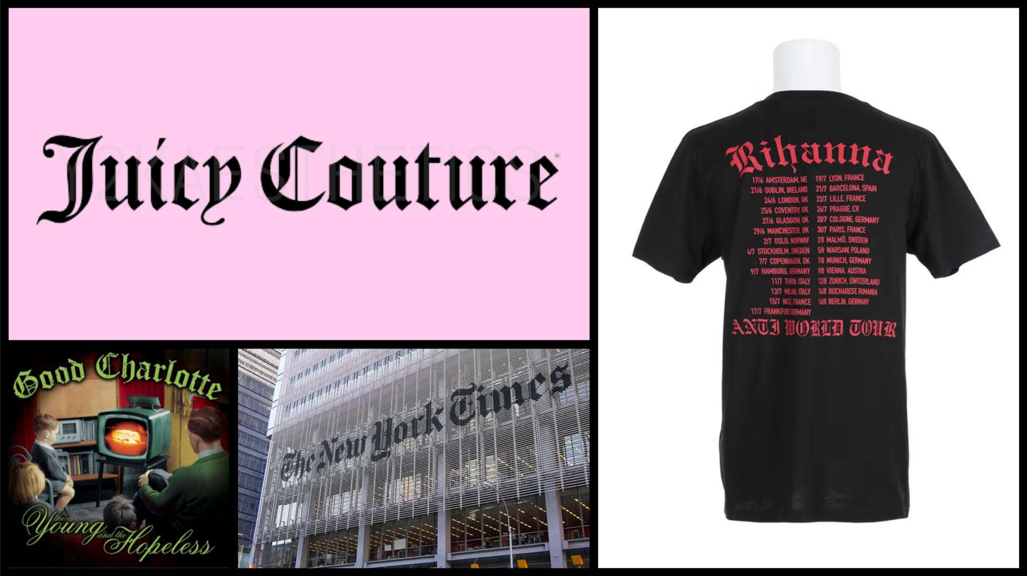
Gothic, or blackletter, (or even Old English) typefaces are as old as dirt. It's bonkers that we're still using a style born in the medieval period, formalized by the Gutenberg Press, and carried through the Renaissance until the 16th century. It didn’t stop there, either. Germany and Austria kept using it until the first half of the 20th century, most western newspapers used it for their mastheads and still do, and there were hints of it across the Arts and Crafts movement and Art Nouveau. And then Hitler banned it in the 1940s (which is ironic, given that he’d previously used the hell out of it). Womp womp womp.
Since then, fonts have overwhelmingly been modern, standardized, geometric, and highly-readable — the Bauhaus movement was the turning point, followed by modernism, the International Typographic Style (Helvetica), through the postmodern period, the digital era, and on to today. Lots of sans serifs, serifs, some scripts and slabs. I'm painting with broad strokes, of course, but that's the arc.
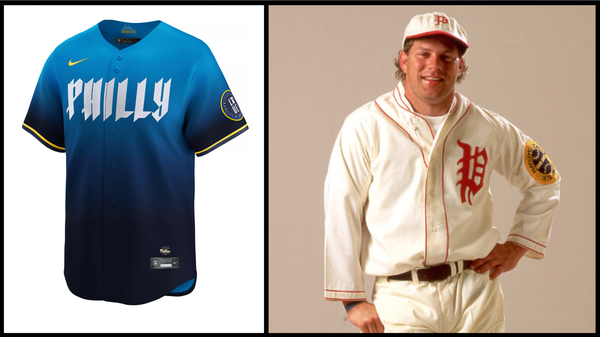
And yet those ancient gothic letterforms are somehow still trendy, their popularity ebbing and flowing across the decades. I can think of a blip ten years ago, twenty, thirty, forty. Culturally, the typeface has evolved quite a bit; my brain, for example, is much quicker to link blackletter to underground music, fashion, tattoos, and art than it is to monks. But subcultures aren't the only participants; big brands love it too. The Phillies use it and always have (peep their 1925 uniform!).
Either way you take it, medieval or metal, the style is undoubtedly declarative and strong. In the same breath, though, it's also artistic and deeply human; it evolved from handwriting, after all. And it’s definitely disruptive, often because it's plopped down into a sea of sans serifs — I do exactly that, pairing it with F37 Ginger, a modern geometric sans serif. The tension between the two is what makes it so interesting to look at.
There's also something comforting about seeing those ancient, variable letterforms on a digital screen. We’re practically living in a medieval fiefdom, the way tech and corporations overlord us, and blackletter is a cathartic, rebellious scream back at the machine.
It may be trendy, but it's a well-matched trend for the era we're in, so I'll happily jump on that bandwagon. And as history proves, the cyclicality of our love for blackletter will keep it from ever truly dying. Certain aesthetics are too alive to be finished off for good! Stability like that is nothing short of badass.
Some Brand Notes
- The baby photo trend took over my feed this month. Truly every small brand participated. But shoutout to Kaboom! for pioneering it; they've had baby photos on their website for years.
- Also loved this Bartram's Garden post, a nostalgia compilation of their space from the 90s, with an 1890s shot quietly slipped in. Such a good flex.
- NPR's new identity is so clever.
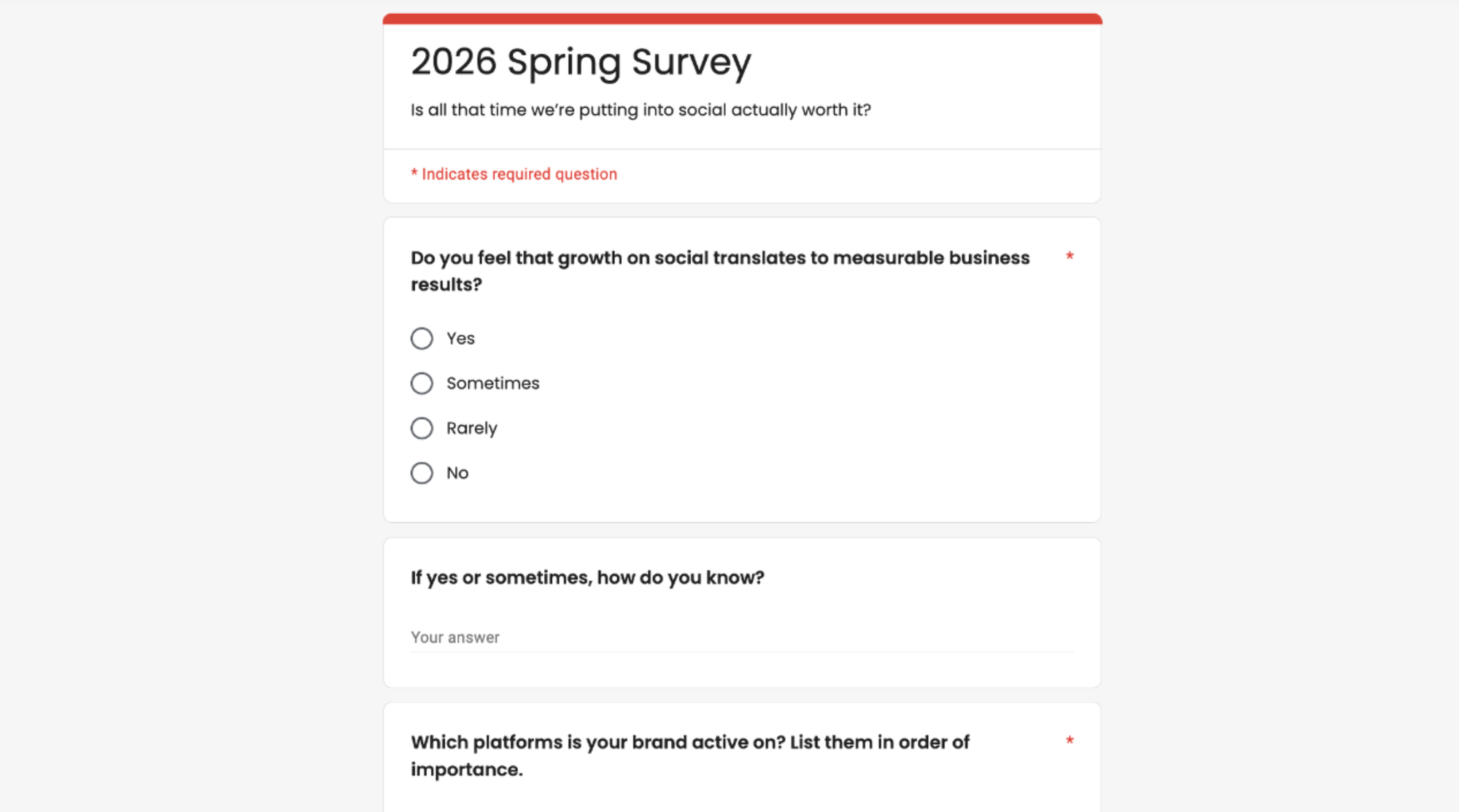
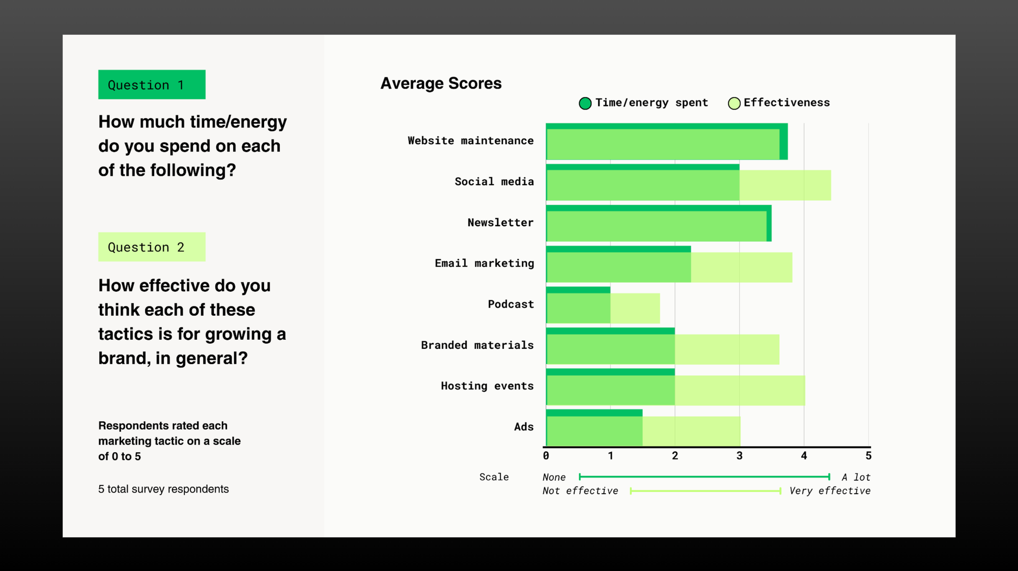
Our spring survey: Is all that time we’re putting into social actually worth it?
For a while, I was promoting Tincan on Instagram. Packaging up digestible tidbits, tagging people I mentioned, putting myself out there. It drove some clicks to itstincan.com. Not a ton, but some — though it almost never resulted in a single new subscriber, my clearest signal for actual business growth.
Willa Köerner, creator of the indie newsletter Dark Properties, put this conundrum well. In her experience working at an editorial publication, they'd promote their newsletter content to hundreds of thousands of social followers and still only get about 300 reads per article. Roughly 98% of people who saw — and even liked — the content never clicked through. If 98% of your audience isn't doing the one thing that creates measurable impact, it's hard not to ask: what's the point?
And yet. Every once in a while, someone emails me about a project and mentions a post that made them think. I recently reconnected with someone I'd cold-called years ago and who I’ve stayed in loose touch with through social, and we might be working on something big together later this year. I can't point to a single post and say that was the one that made the difference — but something clearly added up.
So I want to know: what are the moments that made your efforts on social feel worthwhile? I set up a Google Form below where you can drop your thoughts, plus a few quantifiable questions so we can, for once, get some data on something we’re all feeling.
My Website Was Fine. I Hated It.
How to know when it’s time to press go on a redesign.
One of the hardest things about being an independent operator is knowing when it's time to redo your website or brand identity. There's no magic moment of clarity. No one's going to swoop in and tell you it's time (not even me). You just have to figure it out yourself. Which is, of course, insanely difficult.
Having just gone through this, here's what I was feeling right before I finally pressed go:
- Dread and embarrassment every time I opened my own site. I never wanted to send it to anyone or show it off (kind of the whole point of a website).
- My messaging wasn't landing. It wasn't inspiring, fun, interesting, or distinct. "A brand studio for everybody" was inclusive to a fault; it wasn't speaking to anyone in particular.
- Endless whack-a-mole. Every tiny update created three more problems to fix. Nothing was straightforward because the foundations had been built piecemeal and shoddily over four years, and everything was cracking under the weight of all that layering.
- A chicken-and-egg spiral. I couldn't redesign the site until I'd nailed my messaging. I couldn't nail my messaging until I thought about how it would live on a site.
- My work had evolved but my website hadn't. It was a showcase of past value, not current offerings.
- And yet! Despite all of this, my website still worked. It functioned. It wasn't beautiful or delightful, but it did what it needed to do, which made redesigning it feel superfluous. It's honestly a miracle I ever got myself to do it.
But I did! Thank god.
Last Scraps
- Seth Godin's kitchen metaphor. Bite-sized and useful, as always.
- Paul Jun on how brand design teams evolve. This part especially:
“Brand is not a logo file. It is not frosting on a finished product. It is not a slide in a keynote. It is the felt experience of a company. The world it builds. The standard it sets. The story people tell about it when nobody from the company is in the room. That kind of work is closer to conducting than decorating.”
Comments